Shared components
Shared components are reusable content trees. They are useful for headers, footers, calls to action, and other sections that should be edited once and rendered in many places.
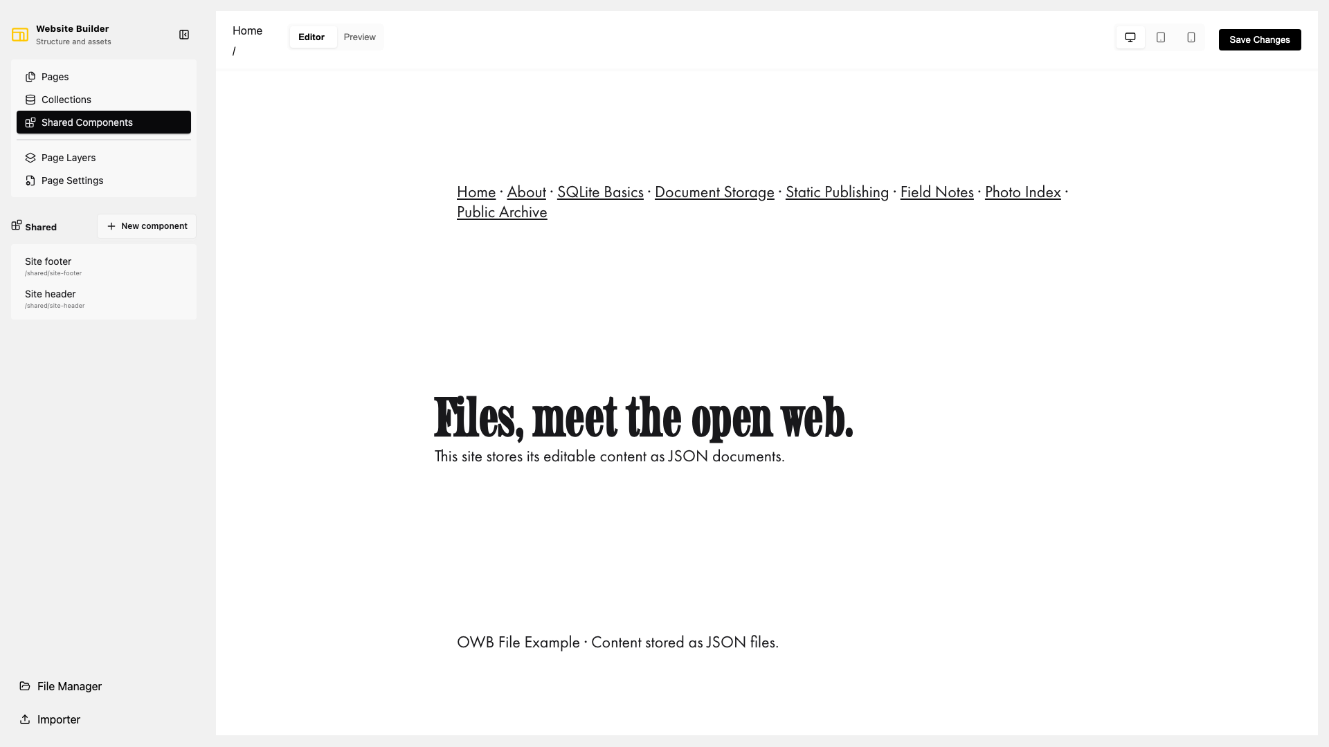
Create a shared component
- Open Shared Components.
- Select New component.
- Open Page Settings to set its ID and title.
- Add sections and blocks to its canvas.
To use it on a page or collection template, select Add element, choose Shared component, and select the component in its settings. The page stores a reference to the shared component rather than copying its content.
Changes to a shared component appear everywhere it is referenced. Check the important pages and collection templates before renaming or deleting one.
File representation
The filesystem backend stores each component at data/shared/<id>.json:
{
  "id": "site-header",
  "type": "shared",
  "title": "Site header",
  "content": []
}
A page references it with a shared block:
{
  "id": "shared-header-home",
  "type": "shared",
  "settings": {
    "shared_component_id": "site-header"
  },
  "content": []
}
Do not place a shared component inside itself, directly or through another shared component, because that creates a circular reference.