Using the editor
Start the website project with npm run dev, then open its /editor route. For the filesystem example this is http://localhost:3005/editor.
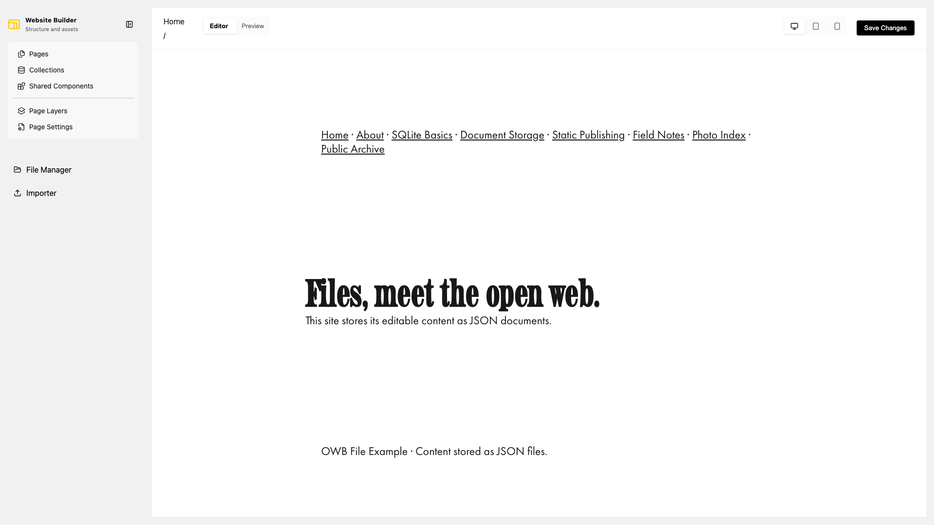
Editor layout
The left sidebar is the main navigation:
- Pages opens standalone pages.
- Collections opens collection templates and their items.
- Shared Components opens reusable content such as headers and footers.
- Page Layers shows the current content tree and supports drag reordering.
- Page Settings controls identity, URL, metadata, and SEO for the selection.
- File Manager uploads and organizes images.
The toolbar switches between Editor and Preview, and between desktop, tablet, and mobile canvas sizes. Tablet and mobile modes also expose an orientation control.
Edit content
Select a page, collection item, or shared component in the sidebar. Text blocks can be edited directly on the canvas. Select a component to open its settings, including spacing, color, layout, and component-specific options.
Sections expose an Add element control. Choose a block type and select Insert block. Available blocks include text, images, buttons, embeds, YouTube videos, containers, forms, galleries, sliders, navigation, collection content, and shared components.
Use Page Layers to inspect nested blocks. Drag a layer by its handle to move it within the content tree. A parent cannot be moved inside one of its own children.
Saving and publishing
Content edits and settings are persisted to the configured backend as they are changed. Save Changes runs the publish operation; it is not required after every field edit. The status beside the button reports whether publishing succeeded and how many pages were generated.
Use Preview to inspect the published URL inside the editor. Run the site's npm run generate command when publishing outside the editor, such as in CI.
Next, learn how to work with pages, collections, and shared components.